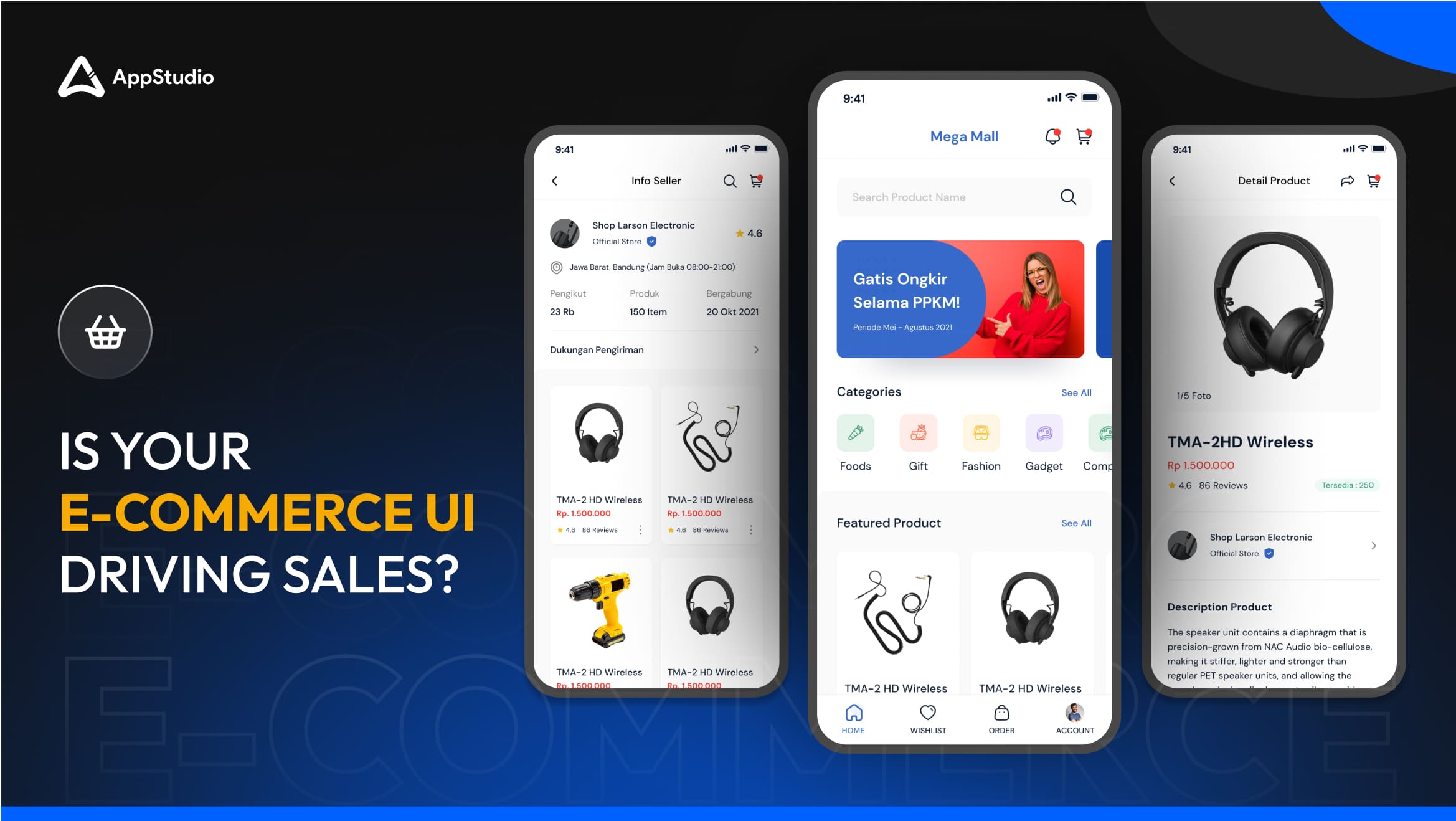
In today’s fast-paced digital marketplace, user interface (UI) can make or break your e-commerce business. The look and feel of your website – more specifically, your UI– plays a crucial role in guiding visitors through their shopping journey.
The question is, could your e-commerce UI be the reason behind lower conversions? With 65% of global e-commerce sales happening, businesses can’t afford to ignore the importance of effective, optimized UI design.
This blog will discuss the essential UI design strategies that make your app or site visually appealing, functional, and customer-centric. Whether you’re planning to build a brand new e-commerce App or revamping the UI of the existing platform ,these following best practices will help you drive engagement, build trust, and convert visitors into loyal customers.
The Role of UI in Your E-commerce site’s Success

The first thing visitors notice when they land on your website or app isn’t your products—it’s your UI. A seamless, attractive, and intuitive user interface instantly creates a positive impression. This first encounter is vital because studies show that 38% of users will stop engaging with a website if the layout is unattractive or hard to use.
An effective UI goes beyond just looks; it’s about making the shopping experience effortless, and enjoyable. Think of UI as the storefront display of a physical store. If it’s messy, confusing, or unappealing, customers leave before they browse. The more fluid and user-friendly the interface is, the more likely it is that users will spend time on the site and, eventually, make a purchase.
Related reading: Kick-Start Your Opportunities With Online Ecommerce Business
Essential E-commerce UI Elements: Building a Website That Sells

Steve Jobs once said, “Design is not just about what things look like, but how they function.” This couldn’t be truer for e-commerce websites. An effective UI incorporates several key elements that guide the user through their journey without frustration.
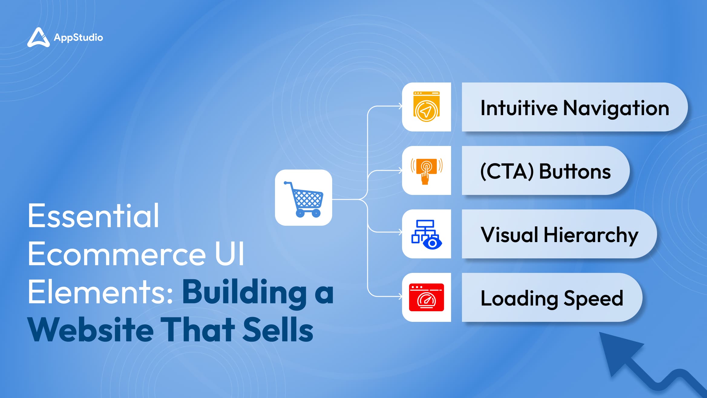
Here are some crucial components of successful ecommerce UI design:
- Intuitive Navigation: Easy-to-understand menus, clear categorization of products, and a powerful search function are critical.
- Clear Call-to-Action (CTA) Buttons: Your “Buy Now,” “Add to Cart,” and “Checkout” buttons should stand out, enticing users to take action.
- Visual Hierarchy: Use contrasting colors, font sizes, and layouts to direct attention to the most important elements, such as special offers or bestsellers.
- Loading Speed: Slow page loading can be a dealbreaker. According to Google, 53% of mobile users abandon sites that take longer than 3 seconds to load. Fast-loading UIs improves user experience and SEO ranking.
These elements work in tandem to ensure that customers don’t just browse your site but also convert, making the overall experience seamless and stress-free.
Role of Branding in UI Design
Your e-commerce platform is more than just a digital storefront; it represents your brand. The design, color schemes, typography, and overall layout should reflect your brand’s values, style, and tone. Customers can sense authenticity, and when your UI aligns with your brand identity, it builds trust and strengthens brand recall.
For example, if your brand promotes luxury and exclusivity, your UI should exude elegance with minimalist designs, high-quality imagery, and a polished interface. On the other hand, a fun, youthful brand might use bold colors, playful animations, and engaging content to reflect its energy. Your UI must be consistent across your website and mobile app development so that customers always feel connected to your brand, regardless of where they engage with you.
Apple has mastered this with its minimalist UI that speaks to its brand ethos of simplicity and innovation. Each element, from the landing page to the product pages, is designed to reflect the premium nature of its products.
Related reading: Steps to Build A Successful eCommerce Website For Your Business
Role of UI/UX in Mobile Apps
The world is going mobile, and so is e-commerce. With mobile commerce (m-commerce) expected to reach 62% of total e-commerce sales by 2027, optimizing your website for mobile devices is no longer optional—it’s mandatory.
Mobile optimization goes beyond having a responsive design. A mobile-friendly UI must prioritize fast loading, intuitive navigation, and touch-friendly interactions specifically designed for smaller screens. Unlike desktop experiences, mobile interfaces require a unique approach—what works on desktop might not translate well on mobile. A sluggish mobile site can lead to frustrated users, abandoned carts, and lost conversions, especially for e-commerce platforms where quick decisions matter most.
Some mobile-first design strategies include:
- Minimizing page elements: Mobile screens offer less space, so prioritize the most important information and visuals.
- Accessible navigation: While individual hand sizes may vary, placing key buttons like “Buy Now” within the natural reach of most users can improve ease of use, whether with one hand or thumb.
- Optimizing product images: High-resolution images that load quickly are critical for showcasing products on mobile.
Consider how Amazon has mastered mobile optimization. Its mobile app and website development provide a seamless experience, allowing users to browse, add items to their carts, and complete purchases with minimal friction.
Power of Trust Signals & Social Proof
Trust is one of the most valuable currencies in e-commerce, social proof is the next in play. These include customer reviews, security badges, return policies, and social media testimonials—all visible directly within the UI.
For instance, adding a “Verified Customer Reviews” section on product pages can greatly influence purchase decisions. Studies show that 88% of people trust online reviews as much as personal recommendations. Additionally, showcasing security certifications (e.g., SSL) builds trust in the checkout process, reassuring users that their payment information is secure.
Related reading: How to Build an E commerce Application Like Amazon?
Enhancing E-commerce UI with Visual Aesthetics
In e-commerce, the importance of a visually appealing interface cannot be overstated. Visuals are not just about aesthetics; they influence the user’s subconscious mind and dictate their perception of your brand.
It’s no coincidence that some of the world’s most successful e-commerce platforms, like Nike and Zara, invest heavily in their visual design. Their use of bold, high-quality images, consistent color schemes, and sleek fonts isn’t just about looking good—it’s about evoking emotions that align with their brand identity.
Simplifying Navigation For Better User Experience
Even a beautifully designed UI can quickly become a frustrating experience if users can’t easily find what they’re looking for. Simplifying navigation is one of the most effective ways to ensure a positive user experience and, ultimately, more conversions. Clear navigation allows users to browse your site seamlessly without feeling overwhelmed or lost.
Here are some key strategies for simplifying navigation:
- Use Descriptive Labels: Avoid clever or vague labels. Stick to clear, commonly understood terms like “Shop Men,” “Shop Women,” or “Sale.”
- Minimize Menu Options: Too many choices can overwhelm users. Limit the number of main categories in your navigation bar and use subcategories where needed.
- Add a Search Function: A powerful search bar is crucial for larger e-commerce sites. It allows users to quickly find specific products without digging through multiple pages.
- Breadcrumb Navigation: Display a user’s path to reach their current page, making it easier to go back or navigate to other sections.
Users who can easily find what they need will be more likely to explore your site. Reducing friction in navigation also reduces the likelihood of abandoned carts and increases overall customer satisfaction.
Related reading: Powerful Reasons To Integrate AI in Ecommerce
E-commerce website optimization For Better Performance
If your website isn’t fast, your customers will be gone in a flash.
To optimize your e-commerce site for performance, consider the following:
- Loading Speed: Compress images, minimize JavaScript, and utilize content delivery networks (CDNs) to ensure your pages load quickly across different regions.
- Mobile Optimization: Ensure that your site functions smoothly on all devices, especially smartphones and tablets. Mobile users expect fast-loading pages and touch-friendly buttons.
- Security: In the age of data breaches, security is non-negotiable. Implement SSL certificates and two-factor authentication and ensure PCI compliance to secure transactions and customer data.
- Scalability: As your business grows, so will the traffic to your site. Make sure your hosting solution can handle large traffic spikes without crashing.
A well-performing e-commerce site ensures a smooth shopping experience and builds trust, particularly when users see secure payment methods and fast-loading pages. Performance optimization is ongoing, but the rewards—faster speeds, better SEO rankings, and happier customers—are well worth the investment.
The Art of UX Design

UX design is all about creating a seamless and intuitive journey for your customers. Users with a positive experience are more likely to return and recommend your e-commerce platform to others.
Here are some UX design principles to keep in mind:
- Understand Your Users: Conduct user research to gather insights about your audience. Understanding their needs, preferences, and pain points will guide your design decisions.
- Usability Testing: Regularly test your site with real users. This helps identify issues in the user journey and allows you to make data-driven improvements.
- Clear Calls to Action (CTAs): Your CTAs should be clear, concise, and strategically placed throughout your site. Use action-oriented language that encourages users to take the next step.
- Feedback Mechanisms: Incorporate feedback options like ratings or comments to give users a voice. This not only helps you improve but also makes customers feel valued.
Related reading: 10 Mistakes to Circumvent During The eCommerce Website Development
Building a Strong Brand Identity in E-commerce UI
“Your brand is what other people say about you. Your brand is how you make them feel.”
A strong brand identity is crucial in the crowded e-commerce landscape. It helps differentiate your business from competitors and fosters trust with customers. Your website’s UI should reflect your brand’s personality, values, and mission.
To align your UI with your brand identity, consider the following:
- Keep your design and content uniform by using the same colors, logos, and fonts across your site. This enhances brand recognition and ensures a cohesive user experience.
- The tone of voice should reflect your brand’s personality—whether playful, professional, or casual—to build trust and establish a deeper connection with your audience.
Successful E-commerce Website Design Examples
“Success leaves clues.”
One of the best ways to learn about effective e-commerce UI design is by looking at successful examples. Here are a few notable e-commerce websites that excel in UI and UX:
- Amazon: With its intuitive navigation, personalized recommendations, and streamlined checkout process, Amazon sets a high standard for e-commerce design.
- Warby Parker: This eyewear company utilizes a clean, modern aesthetic, high-quality images, and a seamless virtual try-on feature, enhancing user engagement.
- ASOS: Known for its trendy fashion offerings, ASOS uses vibrant visuals, easy navigation, and a strong mobile experience, making shopping enjoyable for users.
- Shopify: As a platform for building e-commerce sites, Shopify provides many customizable templates that prioritize user experience and brand identity.
By studying these successful examples, you can gather insights and inspiration to enhance the design of your own e-commerce website or think smarter; contact Appstudio.
Related reading: 9 Key Features of Retail Mobile Apps to Ensure Success
Conclusion:
Crafting a successful e-commerce UI involves a delicate balance of aesthetics, usability, and branding. By focusing on user experience, optimizing for mobile, and incorporating trust signals, you can create a site that resonates with your audience and drives sales.
If you’re looking to elevate your e-commerce platform and enhance user experience, consider partnering with our expert team at Appstudio. Together, we can create a stunning online presence that captivates customers and fosters long-term success.
Frequently Asked Questions
UI design is crucial for creating a positive first impression and guiding visitors through their shopping journey. An effective UI ensures easy navigation, highlights important elements like Call-to-Action (CTA) buttons, and provides a seamless user experience, ultimately increasing conversions and customer satisfaction.
A poorly designed UI can frustrate users, leading to higher bounce rates and cart abandonment. Slow loading times, confusing navigation, and unattractive layouts can deter potential customers from exploring your site and completing purchases.
Key elements include intuitive navigation, clear and prominent CTA buttons, visual hierarchy (using contrasting colors and fonts to draw attention), fast loading speeds, and mobile optimization. These components work together to provide a smooth, engaging shopping experience that encourages users to browse and make purchases.
With 65% of global e-commerce sales occurring on mobile devices, mobile optimization is critical. A mobile-optimized site ensures that users on smaller screens can easily navigate, view products, and complete purchases. Without proper mobile optimization, you risk losing customers due to poor functionality and slow load times.
Your e-commerce UI should reflect your brand’s values, tone, and style through consistent design elements like color schemes, typography, and imagery. A well-aligned UI not only enhances brand recognition but also builds trust with your audience, making them more likely to engage with and purchase from your site.
A well-designed UX/UI ensures that users can easily navigate through the website, find products quickly, and have an overall seamless shopping experience. This directly impacts customer satisfaction and retention. In e-commerce, where competition is fierce, a smooth, intuitive interface can be the difference between a sale and a bounce. Good UX/UI design also reduces the chances of abandoned carts by simplifying the checkout process and making interactions more engaging. Ultimately, it drives higher conversion rates, fosters brand loyalty, and improves the overall perception of your online store.


